Space holds a prominent role in communicating a brand’s identity with its clients. The project involved the study of an architectural pilot model for a new chain store refreshment/snack bar. This pilot model combined with the brand’s identity graphic design aimed at promoting brand awareness and interconnection of the end user to the product or service provided.
Throughout the process of designing the brand identity, the requirements of the housing facilities and the intentions of the venture were carefully laid down. A model refreshment-snack bar was designed in an “ideal” facility of a specific area, façade and proportions, with the following criteria: brand awareness, prioritising function and product promotion, adjustability, fast and easy repetition and medium budget. A variety of architectural features compose the proposed brand identity, designed to be dominant in every store, without having to be applied as a whole.
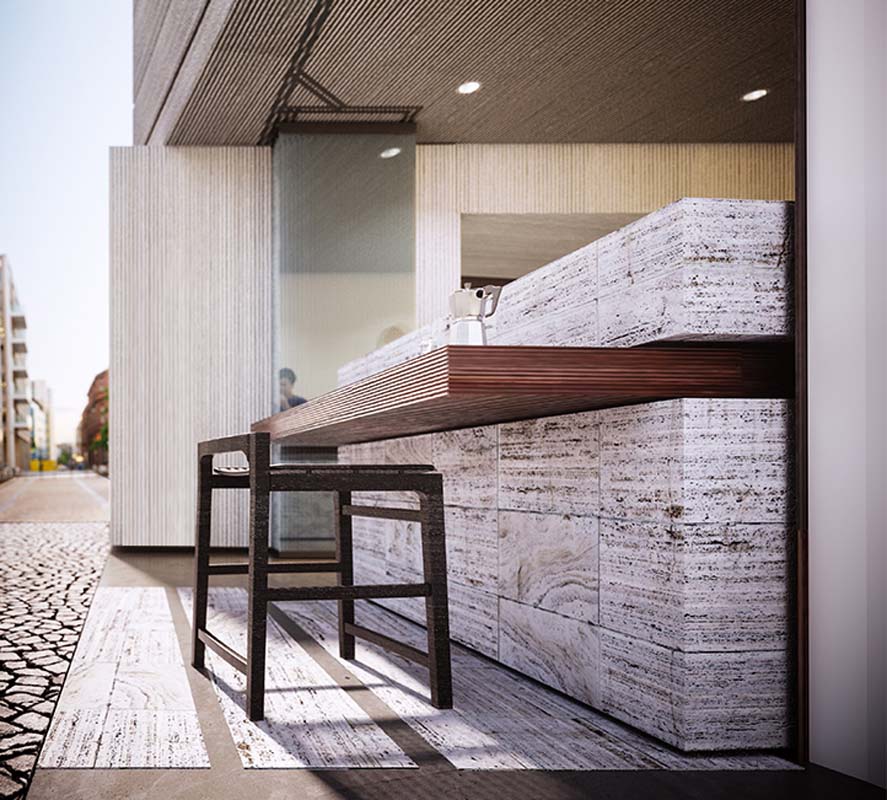
A diagonal axis was selected along the plan, creating a movement that encouraged fragmentation of the common continuous display of products and functions and the simultaneous but hierarchical promotion of both independent functions (café – food). Avoidance of overcrowding, securing immediacy with the street creating an inward direction and allowing visual contact with all the products were also achieved by the diagonal movement. This constant diagonal flow is denoted by elongated wooden elements of orthogonal profile and various thicknesses,that are either buried in the floor or suspended from the ceiling in different heights.
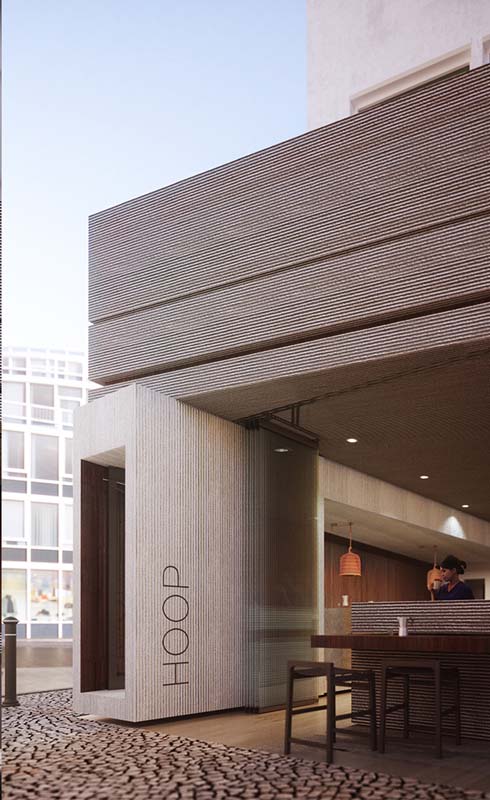
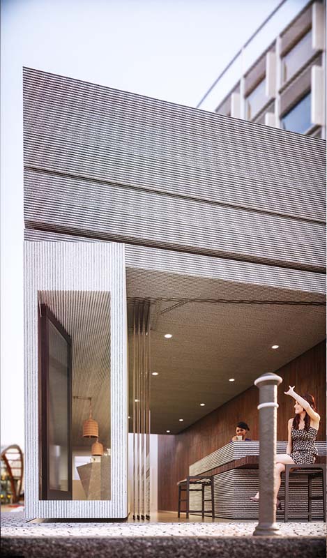
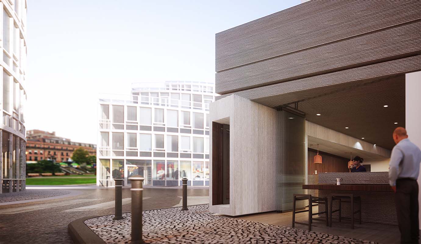
At the entrance, in relation to a recess in the façade, that acts as a surprising element,a wooden cube is created,enclosing the dominant function of the store- coffee. This powerful, warm feature attracts passers-by and creates a friendly atmosphere but also a sense of luxury that is usually missing from such stores. Although impressive, this element only requires a limited area to expand upon. Its design and structure is undoubtedly timeless and is a key feature of the brand identity. The cube encloses the coffee bar, with its two frontages evenly distributed, one towards the street and the other along the diagonal course, suggesting an inward gesture.
Furthermore, the space is elevated from street level signifying and promoting its presence. Two operationally different powerful vertical walls occupy the space. The wall constantly facing the client (the backdrop of the food preparation and sales area) is always subject to things happening. However further visual stimuli are needed to divert the client during waiting time and this is achieved by selected Graphic featureson the wall. The elongated wall on top of the food-waiting counter is intended to communicate a single strong message to the client that is graphically expressed in large embossed Lettering, a strong phrase that and describes the space and is part of the brand’s identity.
Wood, metal (beams and sheets), glass and light-coloured mortar cement have been used throughout, amplifying the sense of friendliness and luxury.


